Retro PlayThemes guide App guide
THEMES Desktop Mode, your way

Make Desktop Mode look like nothing else

A theme changes everything you see and hear in Desktop Mode: colors, fonts, pictures, sounds, words, how the screens are laid out, even whole screens written in JavaScript. You start without code, and go as far as you like.

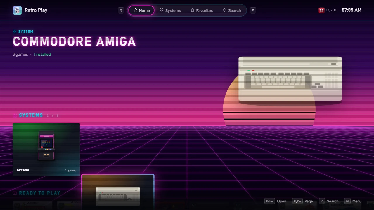
Desktop Mode in the Neon Arcade theme

All topics

From the first color to screens of your own.

1theme.json

Colors, fonts, corners, background, a picture per system, sounds, music, the app’s words, options for the user. No code: the editor writes it for you.

2Scenes

Every screen made of the elements you place where you want: lists of games as rows, grids or wheels, pictures, videos, texts, buttons. Layouts the user chooses among, and each system with its own colours and words.

3CSS

Any CSS, on every element of your scenes and on parts with stable names. Each item of a list knows how far it is from the focus.

4Scripts

HTML pages with JavaScript: effects drawn under or over the screens, and pages placed in a scene. They run in a sandbox and talk to the app through rp.

Every layer is optional. A theme that says only "colors": { "accent": "#ff2bd6" } is a theme; everything it doesn’t say stays as the app draws it.
Atlas
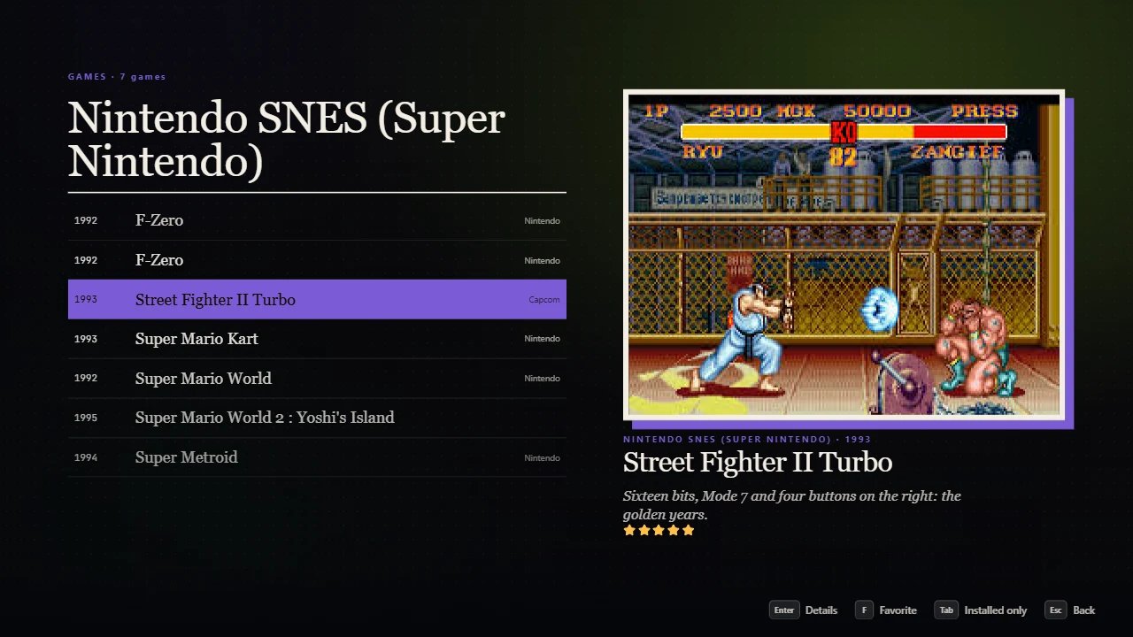
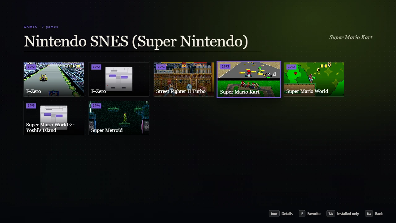
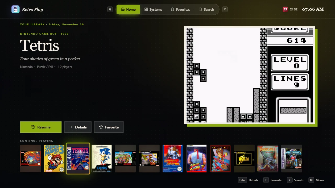
Atlas: an editorial Desktop Mode made of scenes alone, each system in its own colour.
Neon Arcade
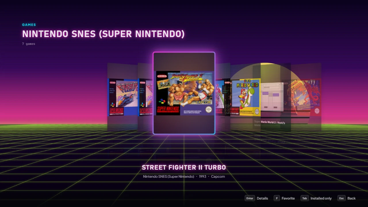
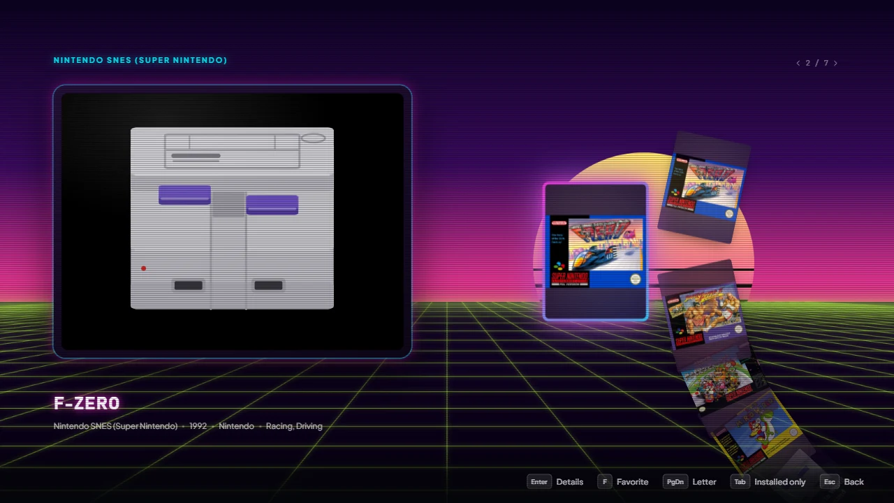
Neon Arcade’s cabinet: a wheel of covers beside a screen playing the game.

Good to know

  • Your themes live in the app’s data folder, under themes: Settings → Appearance → Themes folder opens it.
  • The examples come with the app and can’t be changed: Duplicate one to make it yours.
  • Save a file and Desktop Mode changes at once, without closing it.
  1. Open Settings → Appearance and, under Desktop Mode themes, click New theme.
  2. Give it a name and click Create and open: Desktop Mode opens in your theme, with the editor beside it.
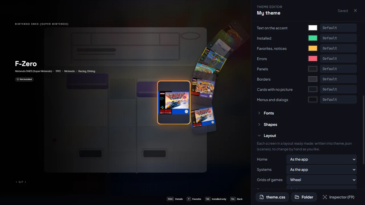
  3. Change the colors, the fonts, the corners, the background, and under Layout choose a layout for each screen (a coverflow, a wheel, a dashboard…): each change shows at once and is saved in theme.json.
  4. Click theme.css at the foot of the editor: it opens in your editor (VS Code, Notepad…). Add a rule and save.
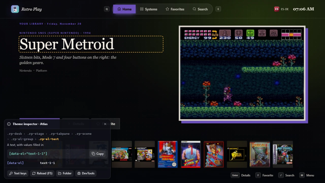
  5. Press F9: the inspector tells the name of what is under the pointer or has the focus, and the selector to copy.
The theme editor beside Desktop Mode
The editor beside Desktop Mode: the games as a wheel, chosen under Layout.

A first rule, for theme.css:

/* The headings of the rows in capitals, a little apart */
.rp-list-title {
  text-transform: uppercase;
  letter-spacing: 0.1em;
}

/* The card with the focus a little larger */
.rp-card.is-focused {
  transform: scale(1.14);
}

Good to know

  • F5 reads the theme again; F10 leaves Desktop Mode.
  • In VS Code, theme.json completes every key and explains it as you type (it names the schema beside your themes).
  • A mistake never breaks the theme: what is wrong is left out, and a notice says where (When something is wrong).
themes/
  theme.schema.json      the schema of theme.json, for your editor (the app writes it)
  rp.d.ts                the types of rp, for scripts (the app writes it)
  my-theme/
    theme.json           what the theme is and what it changes (needed)
    theme.css            its CSS (optional; more files with "styles")
    preview.webp         its picture in the list of themes, 16:9
    systems.json         what each system has of its own (put in by "include")
    fonts/  images/  sounds/  videos/  systems/
    effects/stars.html   a page of scripts drawn as a layer
    pages/home.html      a page of scripts placed in a scene
  • Paths use / and start from the theme folder: "images/bg.webp". In CSS, url(images/bg.webp) starts from the CSS file’s folder.
  • Names must match exactly, capitals too: Logo.PNG is not logo.png.
  • A theme uses only its own files: no address of the network, no file elsewhere on the computer. It works offline, and it can’t track anyone.
  • Pictures: png, jpg, webp, avif, gif, svg. Fonts: woff2, woff, ttf, otf. Sounds: ogg, mp3, wav, flac, m4a. Videos: mp4, webm.

Sharing a theme

Each theme in the list has Export .zip; Import .zip adds one to your themes (its theme.json at the top of the zip, or in one folder). Nothing in a zip is ever written outside the new theme’s folder.

  1. Turn on the MCP server and connect your assistant.
  2. Describe the theme: “dark blue, neon outlines, the games in a coverflow, a soft beep when I move”.
  3. The assistant writes theme.json, the CSS and any effect, fixes what the app finds wrong, and asks before switching Desktop Mode to it.
  4. Open Desktop Mode and ask for changes: each one shows at once.

Good to know

  • It can start from an example: “like Neon Arcade, but green”.
  • It writes only into your own themes; a file it removes goes to the recycle bin.
  • The theme is yours like any other: change it by hand, export it, delete it.
{
  "$schema": "../theme.schema.json",
  "api": 2,
  "name": "Midnight",
  "author": "Me",
  "version": "1.0.0",
  "description": { "en": "Deep blue nights.", "it": "Notti blu." },
  "preview": "preview.webp",
  "colors": { "bg": "#050816", "accent": "#5b8cff", "accent2": "#a46bff" },
  "fonts": { "display": "fonts/Orbitron.woff2" },
  "radius": 2
}
KeyWhat it is
api, nameThe version of the format (2) and the theme’s name. Needed.
author, version, description, previewWho made it, its version, a few words, its 16:9 picture.
colors, fonts, radiusColors, fonts, corners
stylesThe CSS files, in order (theme.css by default).
background, art, introBackground and pictures
sounds, musicSounds and music
textsThe app’s words
optionsOptions for the user
tabsThe sections of the bar, in order: home, systems, favorites, search
scenesThe screens you compose
variants, systems, vars, includeLayouts to choose among, each system its own, files put in
effectsEffects

A text can be one for every language, or one per language: "Start" or { "en": "Start", "it": "Inizio" } (English when the user’s language is missing).

Good to know

  • An unknown key is left out, and the notice suggests the one most likely meant: "colours" → colors.
  • A wrong value leaves out only its part: a wrong element of a scene, not the whole scene.
colorsCSS variableWhere
bg--rp-bgBehind everything
ink, ink2, ink3--rp-ink, --rp-ink-2, --rp-ink-3The text, the text that matters less, the faint text
accent, accent2--rp-accent, --rp-accent-2, --rp-gradThe focus, the buttons, the bar under the section; the gradient of the two
onAccent--rp-on-accentThe text over the accent
ok, warn, danger--rp-ok, --rp-warn, --rp-dangerInstalled; favorites and notices; errors
glass, line--rp-glass, --rp-lineThe panels over the pictures and their borders
card, panel--rp-card, --rp-panelCards with no picture; menus and dialogs

Any CSS color works: "#ff2bd6", "rgb(255 43 214 / 0.8)", "oklch(70% 0.2 330)". Your CSS can set the same variables (:root { --rp-accent: … }): the CSS wins over theme.json, which makes an option that changes colors easy.

Fonts

"fonts": {
  "text": "Segoe UI",                       a font of the computer or of the app
  "display": "fonts/Orbitron.woff2",        a file of the theme
  "mono": [{ "file": "fonts/Mono-Regular.woff2", "weight": "400" },
           { "file": "fonts/Mono-Bold.woff2", "weight": "700" }]
}

text is most text, display the titles, the clock and the big names, mono the numbers. In CSS: var(--rp-font-text), var(--rp-font-display), var(--rp-font-mono). The app’s own: Plus Jakarta Sans Variable, Space Grotesk Variable, JetBrains Mono Variable.

Corners

"radius": 0 for square corners, 1.4 by default, up to 12. In units (see The CSS of a theme); in CSS var(--rp-radius).

"background": {
  "image": "systems/{system}.webp",   one per system…
  "fallback": "images/bg.webp",       …and this for the others
  "video": "videos/loop.mp4",          looped, without sound
  "gameArt": false,                    not the game's picture blurred behind
  "dim": 0.3,                          0 to 1: darker
  "blur": 2                            how blurred the game's picture is, in units
},
"art": {
  "system": "consoles/{system}.png",  in place of the console drawn
  "logo": "logos/{system}.svg"        in place of the system's name
}

{system} is the ES-DE name of the system: snes, megadrive, amiga, arcade… A ROM Set (arcade/0.289) takes its platform’s file. A system without its file keeps the default.

The intro

"intro": { "video": "videos/boot.mp4" }                 plays with its sound, then Desktop Mode
"intro": { "image": "images/logo.png", "duration": 2500, "sound": "sounds/boot.ogg" }
"intro": false                                            no intro

"logo": true keeps the app’s logo and name over your picture. The CSS styles it as .rp-intro, which also lets you write an intro with CSS alone.

"sounds": {
  "move": { "synth": { "wave": "square", "freq": 1046, "to": 988, "dur": 0.03, "gain": 0.012 } },
  "ok": "sounds/ok.ogg",
  "back": { "file": "sounds/back.wav", "volume": 0.6 },
  "edge": false,
  "volume": 0.8
},
"music": { "src": ["music/1.ogg", "music/2.ogg"], "volume": 0.35, "shuffle": true }
SoundWhen
moveThe focus moves
tabAnother section, a jump to a letter
ok, backOpen, confirm; back
edgeNothing further that way
openA menu or panel opens
favorite, unfavoriteMade a favorite, or not any more
launch, errorA game starts; something went wrong
tick, winThe wheel of Cosa gioco oggi turning, and stopped

synth is a note, or a list of up to 16: wave (sine, square, triangle, sawtooth), freq in Hz, to the pitch it slides to, dur and delay in seconds, gain (0.03 is about the app’s). A list plays as a chord or, with delays, as a jingle.

The music pauses while a game is being played, while a video speaks (a game’s page, the attract mode, the intro) and with the menu’s Theme music switch.

"texts": {
  "desk.tabs.home": { "en": "Start", "it": "Inizio" },
  "desk.home.played": "Continue",
  "desk.gamesN": { "en": "{n} carts", "it": "{n} cartucce" }
}

What is in braces ({n}, {name}…) is what the app puts there. To find a key: F9, then Text keys: every word of Desktop Mode shows its key in its place.

The keys

"options": [
  { "id": "crt", "type": "toggle", "label": { "en": "CRT lines", "it": "Righe CRT" }, "default": true },
  { "id": "sky", "type": "select", "label": "Sky", "default": "sunset",
    "choices": [{ "value": "sunset", "label": "Sunset" }, { "value": "night", "label": "Night" }] },
  { "id": "accent", "type": "color", "label": "Accent", "default": "#4fb3ff" },
  { "id": "glow", "type": "range", "label": "Glow", "min": 0, "max": 40, "step": 4, "default": 18, "unit": "px" }
]

The user changes them in Desktop Mode: Menu → Theme, then Theme options (RB). Your theme reads them:

/* A toggle: the attribute when it is on */
.rp-desk[data-opt-crt]::after { content: ''; /* … */ }
/* A choice: the attribute with its value */
.rp-desk[data-opt-sky='night'] .rp-backdrop { filter: brightness(0.6); }
/* Any of them: a variable (a color, a number with its unit, 1 or 0, a quoted choice) */
:root { --rp-accent: var(--opt-accent); }
.rp-hero-title { text-shadow: 0 0 var(--opt-glow) var(--rp-accent); }

In a script: rp.options, and rp.on('options', …) when they change.

"scenes": {
  "games": {
    "elements": [
      { "type": "text", "text": "{screen.title}", "pos": [6, 11] },
      { "type": "list", "id": "games", "source": "screen", "layout": "wheel", "pos": [62, 0], "size": [34, 100] },
      { "type": "image", "of": "games", "media": "marquee", "fit": "contain", "pos": [6, 24], "size": [44, "12u"] },
      { "type": "image", "of": "games", "media": ["screenshot", "titlescreen"], "video": 1.5,
        "pos": [6, 40], "size": [44, "auto"], "style": { "aspectRatio": "4 / 3" } }
    ]
  }
}
SceneThe screen
home, systems, favorites, journeys, searchThe sections of the bar (journeys once the archive has a gaming journey)
gamesA grid opened: a system’s games, all of them, those added last…
gameA game’s page
journeyA journey opened: its steps, each played as the game found for it
frameWhat is over every screen: the bar, the time, the hints

pos and size place an element: a number is a percentage of the box it is in, "12u" is in units, and any CSS length works ("calc(50% - 6u)"). origin, rotate, z, opacity and style (CSS of the element, "fontSize": "4u") do the rest. Without pos an element flows as CSS lays it out: a group with display: flex stacks what it holds. The later elements are drawn over the earlier.

A screen you leave out is the app’s own, which is written the same way. A system can have a scene of its own (its games, the page of its games), and a variant its own scenes.

Atlas, a table of contents
Atlas: the games as a table of contents, the one with the focus as the feature.

Good to know

  • The editor’s Layout writes a layout ready made for a screen in a click: start from it in theme.json.
  • Every element is .rp-el with data-el (its id) and the class you give it: style it in your CSS.
  • F9 shows the id of the element under the pointer.
TypeWhat it is
textWords with values in them: "{focus.name}" (values). scroll: the right stick scrolls it; more: View opens it whole
imageA picture of the game (media: cover, screenshot, titlescreen, marquee, fanart, 3dbox, miximage…, or a list tried in order) or a file of the theme (src); fit, pixelated, fallback, video (its video after a rest), fly. It crossfades as the focus moves
videoThe game’s video, once the focus rests on it
listThe games, systems or pictures the focus moves among (lists)
buttonsPlay (or install, resume, what the game needs), details, favorite, pictures, similar
groupElements together; scroll: "focus" slides them so the one with the focus comes first; rekey plays their animations again at each game
meta, rating, badgesA line of facts (year, developer, genre…), the stars, the pills (installed, played, favorite…)
systemArt, logo, icon, clock, boxThe console of a system, the app’s logo, an icon, the time, a box for your CSS
dots, positionA dot per item of a list; “4 / 120”
keyboard, fieldThe search: its keyboard, the words typed
tabs, brand, status, hintsThe frame: the sections, the logo, the frontend and the time, the buttons
pageA page of the theme with its scripts (page elements)
shelvesThe default Home’s rows

Every element can have id, class, pos, size, origin, rotate, z, opacity, style, when (conditions) and of (the list whose focus it shows).

/* A coverflow */
{ "type": "list", "source": "screen", "layout": "row", "scroll": "focus", "anchor": 0.5,
  "width": 24, "ratio": "3:4", "spacing": 14, "tilt": 52, "scale": 1.1, "fade": 0.13 }

/* A wheel turning around a point far on the right */
{ "type": "list", "layout": "wheel", "wheel": { "angle": -12, "origin": [4.6, 0.5] }, "scale": 1.2 }

/* Lines of your own: the year and the name */
{ "type": "list", "layout": "column", "height": 6,
  "item": { "elements": [ { "type": "text", "text": "{item.year}" }, { "type": "text", "text": "{item.name}" } ] } }
KeyWhat it does
sourcescreen (the screen’s own), played, favorites, installed, recent, discover, today, all, systems, media (the page’s pictures), similar, journeys, "system:snes", "collection:My picks", "journey:My journey" (its steps); fallback: another when it has nothing
layoutrow, column, grid (columns, rowGap), wheel, path (along a winding line lit up to the focus, from a start to a finish; wave: how far it winds)
itemcard, line, plate (a console with its covers fanned out), shot, node (a round picture with its number: a step), journey (a journey’s card), or elements of your own; art: the card’s picture
width, height, ratio, gap, spacingSizes in units; spacing less than the width overlaps them
scroll, anchor, lead, crossfocus: the focus stays at anchor (0 to 1) and the items slide; edge: they stay until the focus nears the edge
scale, fade, tilt, wrapThe item with the focus larger; the others fainter, or turned in 3D; from the last to the first
title, icon, count, empty, limit, moreA heading, what it says with nothing, the card that opens them all

Past the edge of a list, the focus goes to the element found that way on the screen. The item a list has the focus on is focus for the other elements; of names the list.

A wheel of covers
Neon Arcade’s cabinet: a wheel list, and pictures of the game with the focus.

Good to know

  • The list sets each item’s place (left, top): transform, translate, scale and rotate stay yours, with --rel and --dist.
{ "type": "text", "text": "{focus.systemName|upper} · {focus.year}" }
{ "type": "text", "text": "{t.desk.gamesN n=screen.count}" }
{ "type": "text", "text": "{focus.var.tagline}", "when": { "has": "focus.var.tagline" } }
{ "type": "box", "class": "crt", "when": { "option": { "crt": true }, "not": { "aspect": "narrow" } } }
ValueWhat it is
focus.…, item.…, game.…The game with the focus, the item drawn, the page’s game: name, systemName, year, release, developer, publisher, genre, players, rating, played, playTime, blurb, desc, var.…; a system: title, count; a journey: title, author, description, steps, available; a step: the game’s values and note, number, total, available, missing
screen.…The screen: title, count, query, empty; a journey: by, description
var.…, opt.…, t.…, app.…The theme’s values, its options, the app’s words (t.desk.home.played), the time and date

Filters after |: upper, lower, year, date, number, games (12 → “12 games”), ago, duration, default:…, prefix:…, suffix:…, max:….

when shows an element only if all it says holds: variant, option, system, focus (game, system, journey, step…), has (a value that is there), aspect (narrow 4:3, normal, wide 21:9), not.

"variants": [
  { "id": "index", "label": { "en": "Index", "it": "Sommario" } },
  { "id": "gallery", "label": { "en": "Gallery", "it": "Galleria" }, "scenes": { "games": { … } } }
],
"include": ["systems.json"]

/* systems.json */
{ "systems": {
  "snes": { "colors": { "accent": "#7b5cd6" }, "vars": { "tagline": { "en": "Sixteen bits…", "it": "Sedici bit…" } } },
  "megadrive": { "colors": { "accent": "#2f6fde" } }
} }
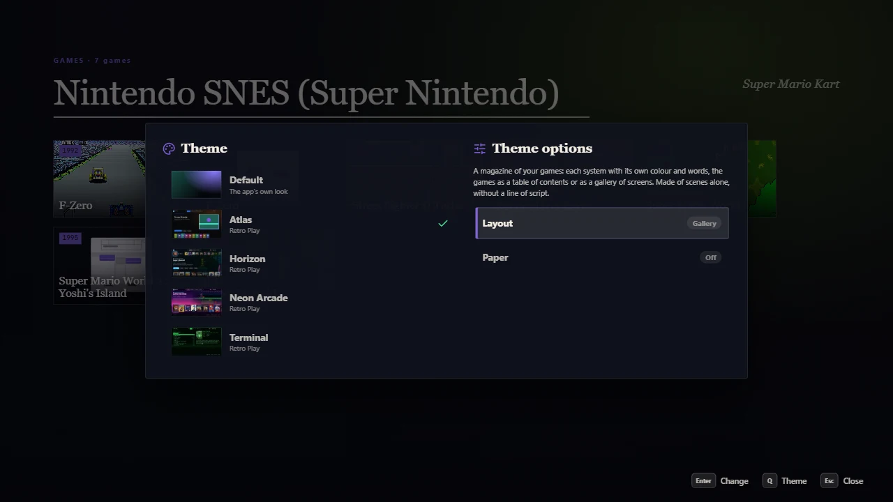
  • Variants: the user chooses among them in Desktop Mode, Menu → Theme, then Layout among the options. A variant changes the scenes and values it says; the first is the default. The CSS sees [data-variant="gallery"].
  • Systems: while the focus is on a system or one of its games, its colours and values win ({focus.var.tagline}, var(--var-tagline)); its scenes are used for its games and their pages.
  • vars: values of the theme by name, one per language if you like. include: JSON files put into theme.json first.
Layout among the options
Atlas from Desktop Mode’s menu: its layout among its options.
  • Only Desktop Mode. Every rule is put under its root: .rp-card means the cards of Desktop Mode, never the library. :root, html, body and .rp-desk all mean Desktop Mode itself.
  • It wins. Your rules weigh more than the app’s, whatever its selectors: write the selector you mean, nothing more. Only what the app sets on the element itself (an item’s place, a few sizes) needs your !important.
  • Your elements. Every element of a scene is .rp-el.rp-el-<type>, [data-el="its id"], with the classes you give it.
  • The unit. var(--u) is a hundredth of the height of a 16:9 screen as large as the window: calc(var(--u) * 2) looks the same on a TV, a monitor, an ultrawide.
  • Files. url(images/bg.webp) starts from the CSS file’s folder. More files: "styles": ["base.css", "screens.css"].
  • Not allowed. @import and addresses of the network are left out, with a notice.
  • Animations. Any @keyframes; a keyframe with the name of one of the app’s (dk-fade…) takes its place.
  • New CSS. The app runs on a recent Chromium: nesting, :has(), container queries, color-mix(), @property, view transitions.
/* Each section of the bar its own color */
.rp-tab[data-tab='systems'].is-on { color: #7ce7ff; }

/* Nesting works */
.rp-detail {
  .rp-detail-desc { font-size: calc(var(--u) * 2); }
  &[data-system='snes'] .rp-detail-shade { background: linear-gradient(transparent, #2a1a5e); }
}

Good to know

  • Keep effects heavy on the GPU (big blurs, backdrop-filter on every card) for one element at a time: Desktop Mode moves many items.
  • F9 → DevTools opens Chromium’s developer tools: you can try CSS live there, then copy it into your file.

Each part also has its states (.is-focused…) and attributes ([data-system]…), listed beside it. F9 shows them on screen.

States

ClassWhen
.is-focusedIt has the focus (a card, a button, a key, a menu entry…)
.is-currentThe item a list is at, with the focus or not
.has-focusA list with the focus; an element of a scrolling group with the focus inside
.is-above, .is-belowThe elements of a scrolling group before and after the one shown
.is-onThe section shown, a switch on
.is-primaryThe main button (Play)
.is-shown, .is-before, .is-afterThe sections: shown, left of it, right of it
.is-covered, .is-leavingA screen under another; a screen going

Attributes

On .rp-desk: data-tab (home, systems, favorites, search), data-screen (the screen on top: also games, game), data-device (pad, keys, mouse), data-pad (xbox, playstation, nintendo, none), data-variant, data-focus-system (the system of the focus), data-screen-system, data-theme-id, data-opt-…. On elements: data-el, data-focused; on lists data-layout, data-source. On items and games: data-system, data-installed, data-favorite, data-kind. On buttons: data-action.

/* Installed games brighter, with the joypad only */
.rp-desk[data-device='pad'] .rp-card:not([data-installed]) { opacity: 0.55; }

Numbers

VariableOnWhat it is
--ithe items of listsIts place in its list: 0, 1, 2…
--relthe sameWhere it is from the focus: …−2, −1, 0, 1, 2…
--distthe sameHow far from the focus: 0, 1, 2…
--focus, --count, --colslistsWhere the focus is, how many, the columns of a grid
--row, --colthe items of a gridIts row and column
--block-rel, --scrollscrolling groupsWhere an element is from the one shown; how far it slid
--hsystemsThe hue of the system, 0 to 360

They are numbers: use them in calc(), and animate them (transition: --rel 300ms). The list places each item; turn it, lift it or light it with them:

.my-row .rp-item {
  transform: rotateY(calc(clamp(-1, var(--rel), 1) * -50deg));
  scale: calc(1 - var(--dist) * 0.07);
}

A CRT over everything

.rp-desk::after {
  content: '';
  position: absolute;
  inset: 0;
  z-index: 160;
  pointer-events: none;
  background: repeating-linear-gradient(rgb(0 0 0 / 0.25) 0 1px, transparent 1px 3px);
}

A list as a drum, turning in 3D

.my-drum .rp-list-track { perspective: calc(var(--u) * 80); }
.my-drum .rp-item {
  transform: rotateX(calc(var(--rel) * -14deg)) translateZ(calc(var(--dist) * var(--u) * -4));
  opacity: calc(1 - var(--dist) * 0.18);
}

A color per system

/* In theme.json: "systems": { "megadrive": { "colors": { "accent": "#3a7bff" } } } — or in CSS: */
.rp-desk[data-focus-system='nes'] { --rp-accent: #e60012; }

The names under the covers

.rp-card-title {
  display: block;
  margin-top: calc(var(--u) * 1);
  font-size: calc(var(--u) * 1.5);
  text-align: center;
}

Another icon for a section

.rp-tab[data-tab='home'] svg { display: none; }
.rp-tab[data-tab='home']::before {
  content: '';
  width: calc(var(--u) * 2.2);
  height: calc(var(--u) * 2.2);
  background: url(icons/home.svg) center / contain no-repeat;
}

Hide what you don’t want

.rp-hero-blurb, .rp-card-marks, .rp-brand-name { display: none; }

Colors by an option

.rp-desk[data-opt-phosphor='amber'] {
  --rp-ink: #ffcf7a;
  --rp-accent: #ffb000;
}
"effects": [
  { "id": "stars", "src": "effects/stars.html", "layer": "back" }
]

layer: back over the background and under the screens (the default), front over the screens, top over everything, the menus too. An effect never takes the pointer nor the joypad. It knows what happens:

<canvas id="c"></canvas>
<script>
  // rp is always there: the app puts it in first
  rp.on('press', ({ action }) => pulse())             // any button
  rp.on('focus', (f) => f?.game && tint(f.game.hue))   // the game with the focus
  rp.on('screen', ({ tab, screen }) => …)              // what is shown
  rp.on('launch', (l) => l && l.state === 'started' && …)
  rp.ready.then(() => draw(rp.options))
</script>

Neon Arcade’s neon grid and Horizon’s light in the air are effects: duplicate them to see how.

"scenes": {
  "home": { "elements": [
    { "type": "page", "src": "pages/home.html", "input": true, "pos": [0, 0], "size": [100, 100] }
  ] }
}

Without input the page only draws and hears (a visualizer beside a list). With input it takes the joypad while it has the focus, and says which buttons it takes; the others go on to the scene and to Desktop Mode (LB and RB the sections, Menu the menu, B back). rp.params: on games { query, title }, on a game’s page { id }.

rp.ready.then(async () => {
  rp.take(['up', 'down', 'ok', 'x'])
  const { items } = await rp.games({ only: 'played', limit: 30 })
  let at = 0
  draw(items, at)
  rp.hints([{ action: 'ok', label: await rp.text('desk.hint.details') }, { action: 'x', label: await rp.text('shelf.play') }])
  rp.on('input', ({ action }) => {
    if (action === 'down') draw(items, ++at)
    else if (action === 'up' && at === 0) rp.focusTabs()
    else if (action === 'up') draw(items, --at)
    else if (action === 'ok') rp.open({ game: items[at].id, list: { only: 'played' } })
    else if (action === 'x') items[at].installed ? rp.play(items[at].id) : rp.install(items[at].id)
  })
})
Terminal's Home
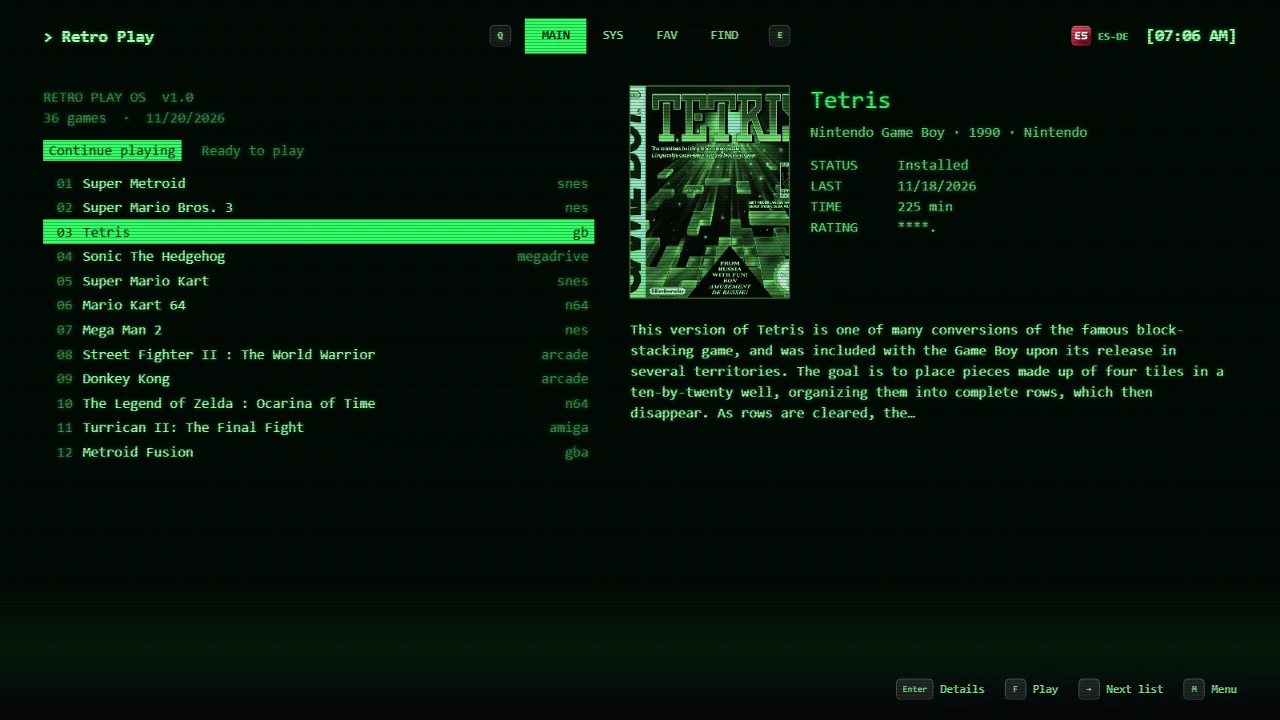
Terminal: its Home is a page element. A game opened from it is the game scene, styled by the theme’s CSS.

Good to know

  • The page’s keys and wheel go to Desktop Mode: F10 always leaves it.
  • rp.take(['text']) gives the screen the letters typed (a search of your own).
  • Leave room for the bar at the top (about 11% of the height), or leave tabs out of the frame.

What it says

PropertyWhat it is
rp.kind'effect', or 'screen' for a page element with input
rp.screen, rp.paramsThe screen it is in, and what it was opened with
rp.activeThe page has the joypad
rp.lang, rp.theme, rp.optionsThe user’s language, the theme, its options
rp.focus, rp.nowThe game or system with the focus; the section and screen shown
rp.readyA promise, once all of these are there

What it does

CallWhat it does
rp.games(query)The games: { total, items }. Query: only (favorites, installed, recent, played), system, query (words), similar, installed, collection, offset, limit (100, up to 500)
rp.game(id)A game with its description and every picture and video (media)
rp.systems(), rp.collections()The systems with their counts; the collections
rp.open(target)The app’s screens: { game, list }, { games, title }, a section, 'menu', 'spin', 'attract'
rp.back()The screen on top closed, or back to Home
rp.play(id, { resume }), rp.install(id)The game started; the app’s panel that installs it (which asks the user)
rp.favorite(id, on)Made a favorite or not; what it is now
rp.take(actions), rp.hints(list)The buttons the screen takes; what they do, at the foot
rp.focusTabs(), rp.spot(id)The focus up to the bar; what the background shows
rp.sound(name), rp.text(key, vars)A sound of Desktop Mode (the theme’s first); the app’s words in the user’s language
rp.systemArt(name)The console the app draws, as a picture address
rp.store.get(key), rp.store.set(key, value)A little of the theme’s own, kept on this computer (64 KB a key)
rp.url(file)A file of the theme, by its path from the theme folder

What it hears

rp.on(…)When
'input'A button the screen takes, while it has the joypad: { action, repeat } (with 'text' taken, { action: 'text', text } and 'erase')
'press'Any button, whoever takes it
'active', 'focus', 'screen'The screen has the joypad or not; the game or system with the focus; what is shown
'launch'A game starting, started or failed ({ state, game }), then null
'options', 'lang'The user changed the options or the language

A game has: id, name, system, systemName, year, releasedate, developer, publisher, genre, players, rating (0 to 5), cover, screenshot, favorite, installed, playedAt, playTime, blurb, hue. Buttons: up down left right ok back x y lb rb lt rt menu view.

  • No app. A page has no access to the app but rp: it can’t read your files, change your settings or delete anything. Installing always goes through the app’s panel, which asks you.
  • No network. It loads only its theme’s files and the archive’s pictures: no site, no font or library from the web. Put any library you need in the theme folder.
  • No storage of its own. No cookies nor localStorage: rp.store keeps what it needs.
  • No windows. No popups, no forms, no frames of other sites.

Good to know

  • Draw with requestAnimationFrame and stop when nothing changes: Desktop Mode runs on living-room PCs too.
  • Errors of a page show in F9 → DevTools, in its own frame.
The inspector
F9: the element, its id and numbers, the selector to copy, and what is wrong in the theme.
ToolWhat it does
F9 inspectorThe element or part under the pointer (or with the focus, with the joypad), what it is in, its id, states, attributes and numbers; Copy puts its selector in the clipboard. Below, the theme’s problems with file and line.
Text keysEvery word of Desktop Mode shows its key in its place: what to write in texts.
F5The theme read again (it is anyway as soon as a file is saved).
DevToolsChromium’s developer tools, for CSS tried live and the errors of scripts.
EditorSettings → Appearance → Edit on one of your themes: Desktop Mode with the editor beside it, its layouts ready made under Layout.
The notice saysWhat to do
theme.json is not valid JSONA comma too many or missing, quotes around keys: the line is given. JSON has no comments.
Unknown keyA typo, often: the key most likely meant is suggested.
The file is not in the themeCheck the path from the theme folder and the capitals.
Not a part of Desktop ModeA class .rp-… that doesn’t exist: the closest is suggested, F9 shows the real ones.
Not allowed@import or an address of the network: put the file in the theme.
“api” must be 2The theme was made for another version of the format.
My CSS does nothing

F9 on the part: is it the name you wrote? A rule on an element hidden by the app (.rp-card-title) needs display: block. What the app sets on the element itself (a card’s place) needs !important, or move it with transform.

A picture or font doesn’t show

The path starts from the theme folder in theme.json and from the CSS file’s folder in CSS; capitals count. A font in fonts needs a .woff2, .woff, .ttf or .otf file.

My page doesn’t get the joypad

Give the page element "input": true, then call rp.take([...]) with the buttons it uses, after rp.ready. The others go to Desktop Mode.

My script can’t load a library

Pages of themes have no network: copy the library’s file into the theme folder and load it from there.

Atlas
Atlas: made of scenes alone. Each system its own colour and words (systems.json), lists drawn with its own elements, two layouts: a table of contents or a gallery of screens.
Neon Arcade
Neon Arcade: chiptune sounds made of notes, a CRT, a neon grid as an effect, and two layouts: a coverflow or an arcade cabinet.
Horizon
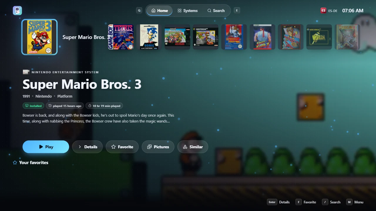
Horizon: Home as a console dashboard, the game’s artwork as background, an accent color option, light in the air as an effect.
Terminal
Terminal: Home is a page element in JavaScript, lines everywhere else, a boot intro in CSS, green or amber phosphor by option.
The themes from the menu
From Desktop Mode: Menu → Theme, with the joypad, and the options of the theme shown, its layout first.